Choosing the right colours for your strata building paintwork can be a loaded decision. As the Strata Manager, not only do you want to give your building the best possible appeal, but you also have to get all your stakeholders on board with the colours and consider the colour scheme’s impact on painting and maintenance, as well as value.
Whatever you do, you want to make a good impression, but you don’t want to make a choice that will cost your committee more time and money later on. So here are a number of colour combinations we recommend you avoid from the outset for your strata paintwork.
Interior paint colours to avoid:
The most important factor to consider for all interior strata paintwork is how the colour fits the space. Whether you’re managing commercial, retail or residential buildings, always consider how the room will be used, including the expected wear and tear, and the texture, colour and material of the flooring.
Avoid dark colours in hallways and stairwells
Dark colours have the effect of making a space appear smaller, which means they’re poorly suited to narrow hallways and stairwells. If these areas also lack natural light, it will only accentuate the feeling of being crammed in.
The wrong white
White is often a natural choice for interiors and can make a small space appear larger and more inviting, however, it’s easy to be led astray. Yellow, brown, green and dusty pink undertones can seem dirty or dated, while cool whites and greys may appear drab when not in direct sunlight.
Earthy or muddy tones in high traffic areas
The last thing you want is for the common spaces in your building to look dirty, so you need to be careful when choosing earthy or muddy tones for your strata paintwork. Browns, tans and yellows, as well as anything with a dingy brown or yellow undertone, will accentuate any dirt that gets trampled in by the constant flow of people, creating a grimy atmosphere.
Interior paint colours to choose:
Neutrals are still a good choice, with the above exceptions in mind. If going with white, the key is to choose a shade that’s not too cool and not too warm—this Goldilocks approach should help you find a balanced, fresh tone.
Don’t be afraid to add a splash of colour to common areas, whether it's on the walls or as an accent. This can liven up a room, as well as differentiate between spaces. As a general rule, warm colours create a more welcoming atmosphere, while cool colours instil a sense of calm.
Exterior paint colours to avoid:
The exterior of the building is the first thing people see, so it’s important to get it right. Consider factors such as the architecture and materials of the building, surroundings, services you offer and current trends when choosing paint colours.
Brown
There’s a reason why one particular shade of brown, Pantone 448C, was once nicknamed the ‘ugliest colour in the world’ and that’s because, when it comes down to it, some colours aren’t visually appealing. In the case of Pantone 448C, it was chosen to market Australian cigarettes in an attempt to deter smokers—don’t let it deter people from your strata building as well.
Too many or too few colours
Using more than three colours for your external paintwork gives a look that is disjointed and overwhelming to look at. Conversely, using only one colour is likely to be too boring and won’t make you stand out from your neighbours. The sweet spot is three colours.
Bright colours
Although adding a pop of colour to the front door or shutters can go down well, avoid anything too unusual for the sidings. While kids might love a bright green or yellow, most tenants don’t.
Exterior paint colours to choose:
Greys have been very popular for exterior paint colours in recent years and while the trend is shifting away from dark tones, the lighter, softer shades are increasing in popularity. In particular, grey beiges, nicknamed ‘greige’, and subtle grey-greens are in growing demand in Australia.
Whatever your colour palette, always follow the three colour rule for external strata paintwork—one for the siding, one for the trim and one for accents, such as the front door.
Finally, consider going a shade darker than you initially think for exterior walls as the paint will look lighter in larger areas.
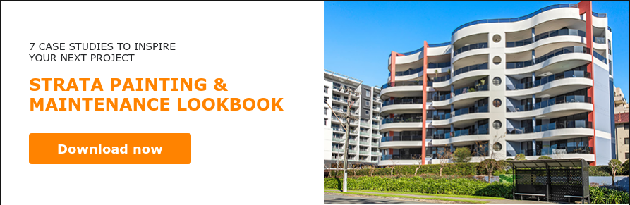
Are you struggling to get your strata painting project off the ground? Our strata lookbook includes seven case studies and two expert interviews that will help you convey the vision of the project to your stakeholders and find a unified way forward. Download it today.
Higgins Coatings is Australia's premier commercial painting contractor with over 75 years of experience in providing cost-effective painting and tailored maintenance solutions to a broad range of industries including hospitals, aged care, schools, and strata. If you need quality painting services delivered on time and within budget, contact us today for a consultation.