Blog

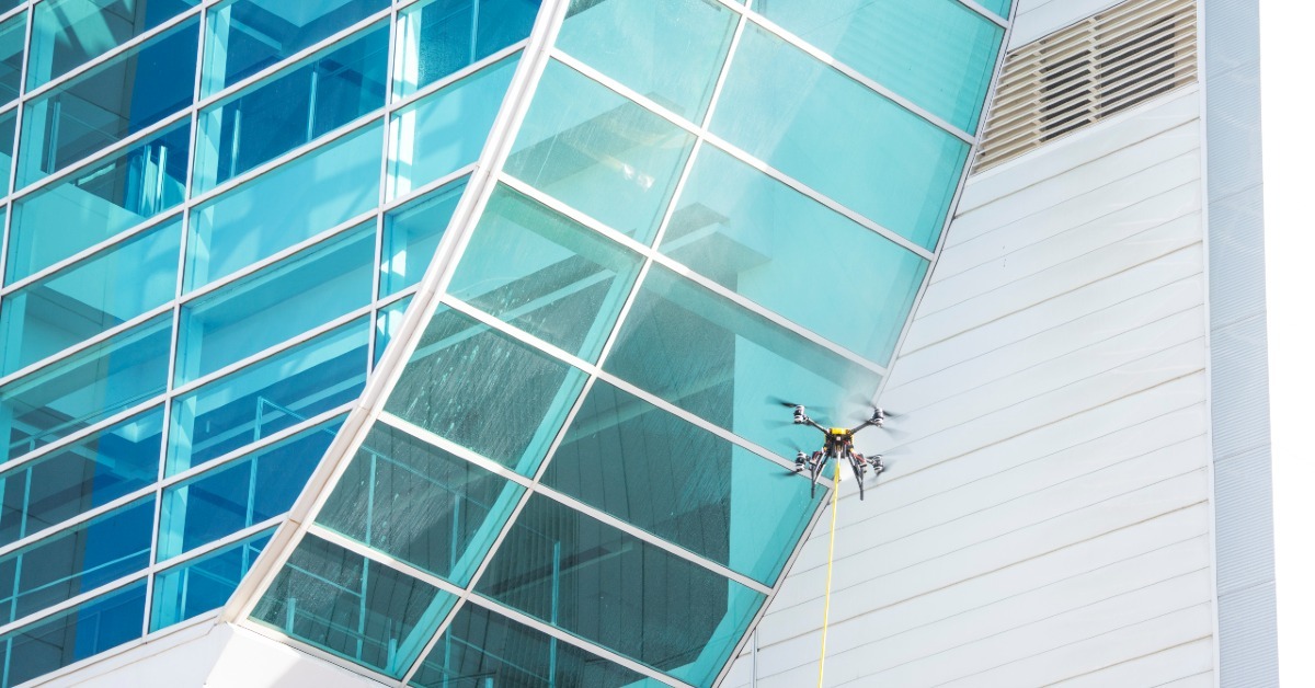
Which building surfaces are suitable for drone washing?
Drone washing delivers impressive results for many building types, but it's not suitable for every surface....
Read More
What to expect from professional drone cleaning services
Drone cleaning services are transforming how owners and facility managers approach building maintenance. If you're...
Read More

Choosing the right external access method for your building
Facade access isn't one-size-fits-all. Your choice of method directly impacts project timeline, operational disruption,...
Read More
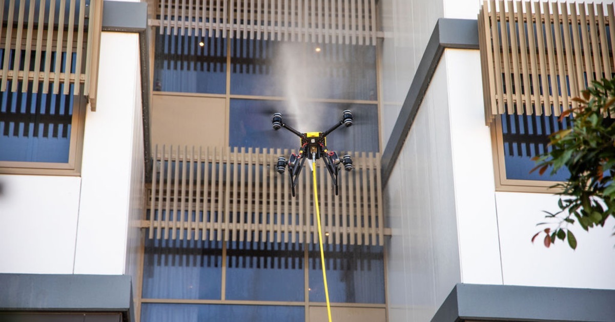
The future of building maintenance technology is here
Drone-pressure washing represents one of the most significant shifts in building maintenance in decades. Property...
Read More
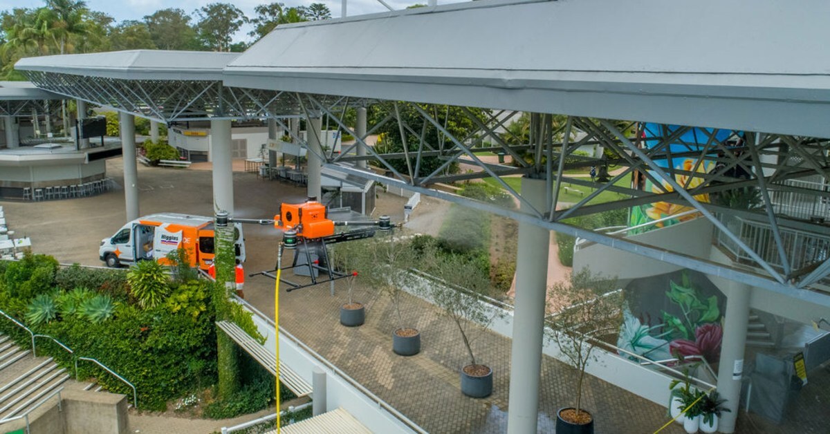
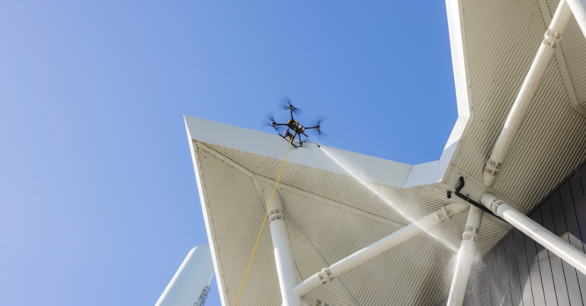
Why asset managers are switching to drone pressure washing
Commercial building pressure washing has long relied on scaffolding, rope access and elevated work platforms to deliver...
Read More
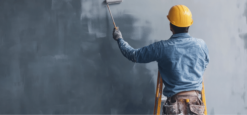
What your building's facade says about your brand
Your building's exterior is speaking to prospective tenants, investors, and visitors. But what message is it sending?
Read More
The cost-effective solution
This is a transcript of our video highlighting the cost savings and efficiency benefits that...
Read More
.jpg)
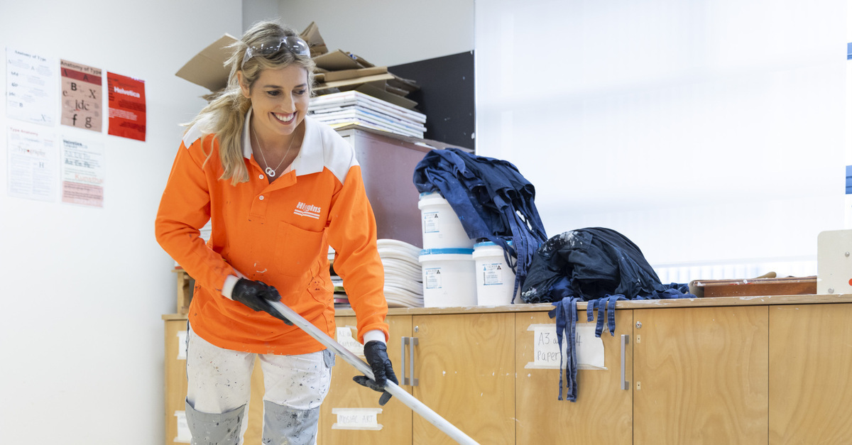
Why schools are choosing floor rejuvenation
The following is a transcript of a video featuring Higgins Coatings team members explaining why...
Read More
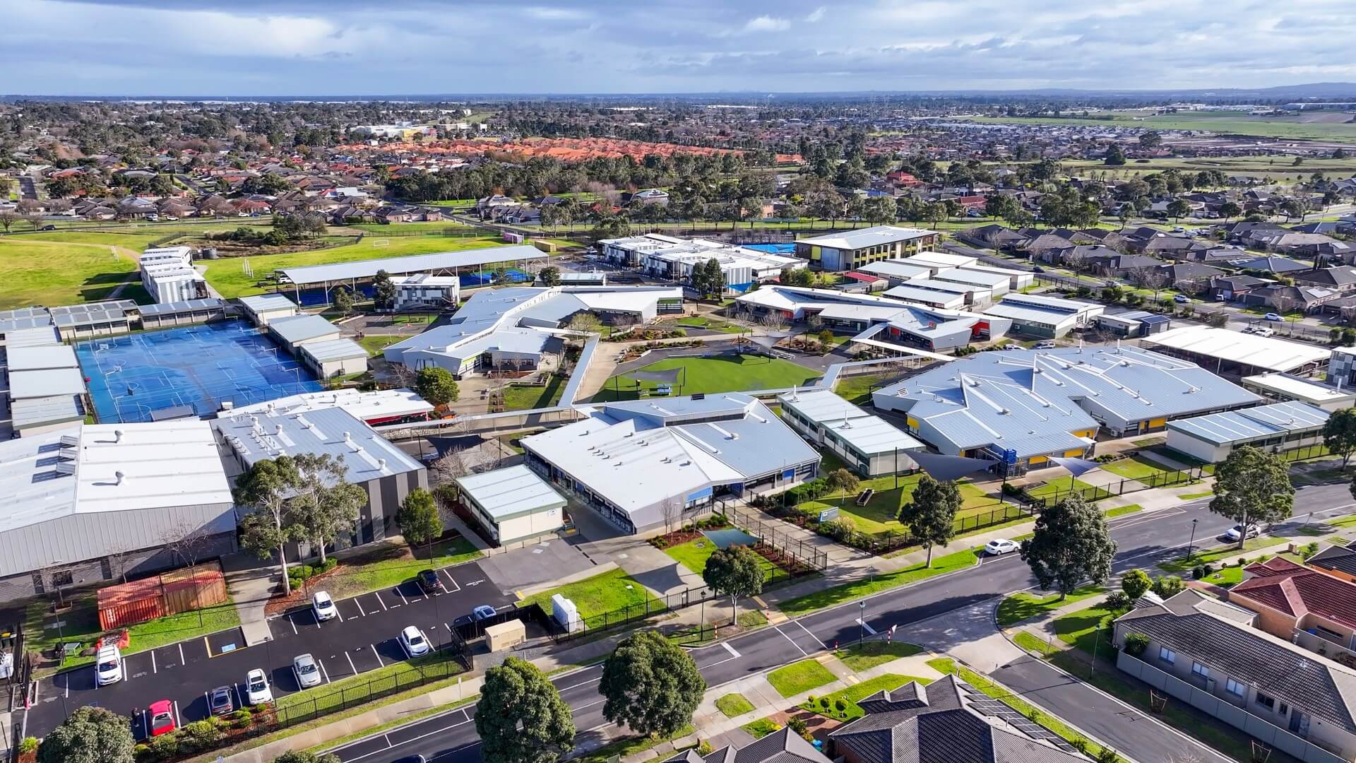
Why leading schools choose Higgins for floor rejuvenation
The following is a transcript of our video featuring a testimonial from a school facilities manager...
Read More